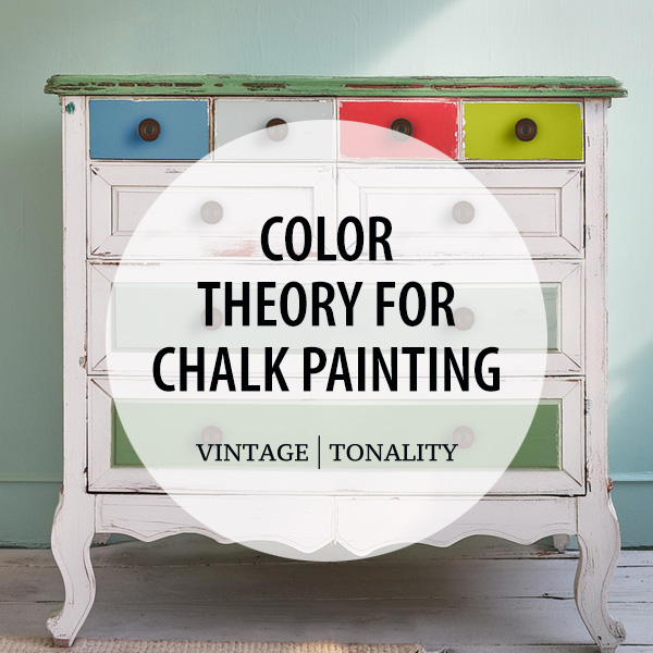
Understanding the 60-30-10 Rule

60% Dominant Color This is the main color that covers the majority of your piece. It sets the overall tone and creates the base of your design.

30% Secondary Color The secondary color complements the dominant color and provides contrast. It should be used to highlight significant areas of your furniture.

10% Accent Color This color adds pops of interest and can be used in small details to create a focal point. It should be bold and eye-catching but not overwhelming.
Example Projects Using the 60-30-10 Rule
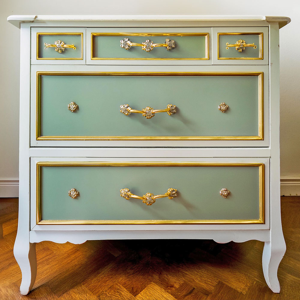
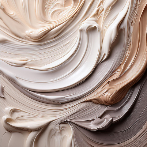
Vintage Dresser
 Dominant Color (60%)
Antique White
Secondary Color (30%)
Sage Green
Dominant Color (60%)
Antique White
Secondary Color (30%)
Sage Green
for drawer fronts
Accent Color (10%)
Gold
for handles & decorative trim
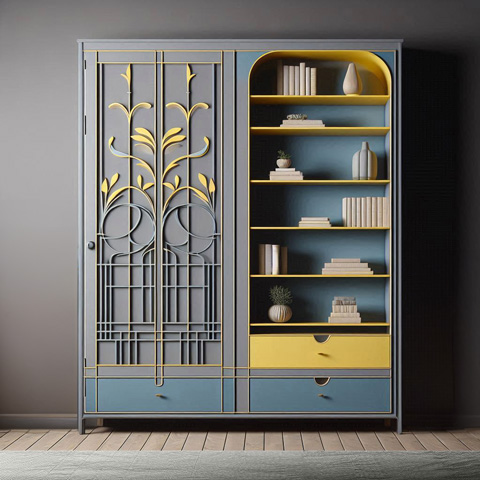
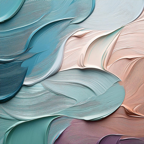
Modern Bookshelf
 Dominant Color (60%)
Soft Gray
Secondary Color (30%)
Muted Blue
Dominant Color (60%)
Soft Gray
Secondary Color (30%)
Muted Blue
for back panels & shelves
Accent Color (10%)
Bright Yellow
for shelf edges & small details
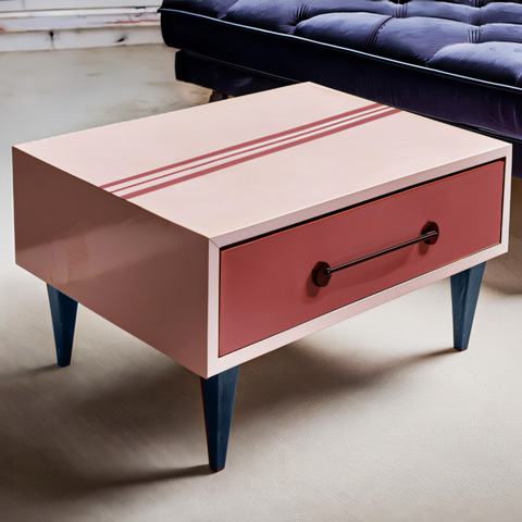
Classic Coffee Table
 Dominant Color (60%)
Pastel Pink
Secondary Color (30%)
Dusty Rose
Dominant Color (60%)
Pastel Pink
Secondary Color (30%)
Dusty Rose
for drawer fronts & retro stripe
Accent Color (10%)
Deep Navy
for table legs
Applying the 60-30-10 Rule to Chalk Painting Furniture
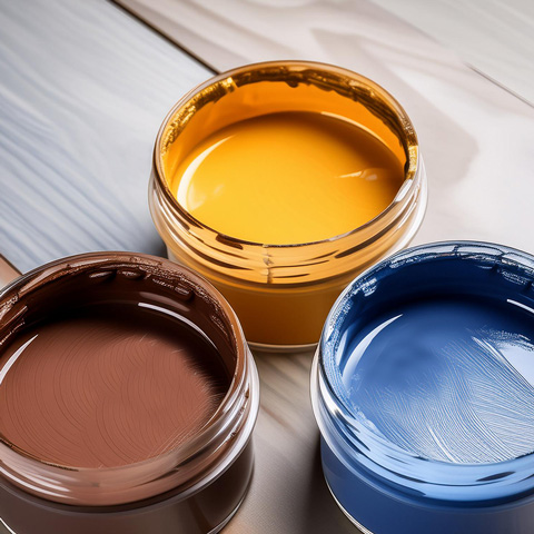
1. Choosing Your Colors
Dominant ColorSelect a neutral or soft color for the largest areas of your furniture, such as the body or main surfaces. Chalk paint colors like antique white, soft gray, or pastel shades are excellent choices.
Secondary ColorPick a complementary color that stands out but still harmonizes with the dominant color. Consider using colors like muted blue, sage green, or dusty rose.

Accent ColorChoose a bold and vibrant color for small details. Bright yellow, deep navy, or rich gold can serve as excellent accent colors.
*TIP - Not sure about your color choices? Check out our article, "Understanding Color Theory," to achieve the best color harmony and results.
2. Preparation and Planning
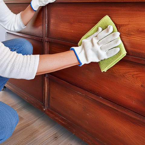
Clean and SandBefore you start painting, clean your furniture thoroughly and sand it to create a smooth surface for the paint to adhere to.
Plan Your DesignVisualize where each color will be applied. Sketch your design on paper or use masking tape to outline different sections on your furniture.
3. Painting Process
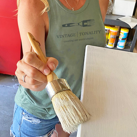
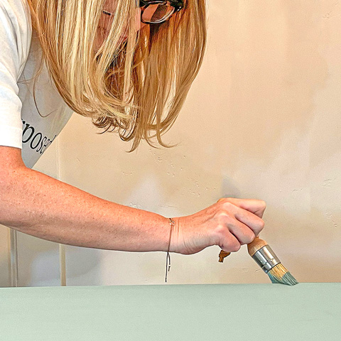
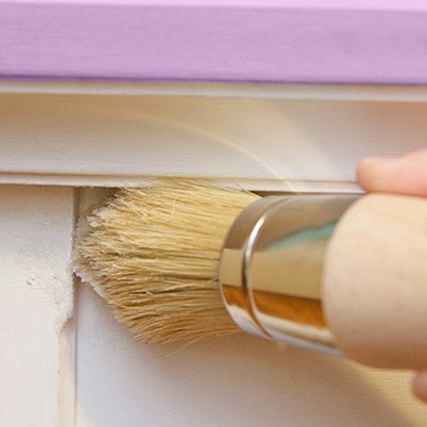
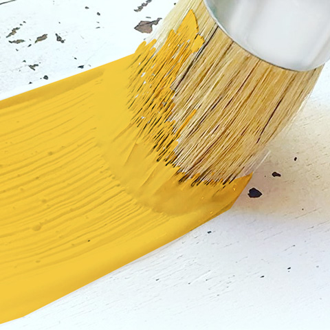
Apply the Dominant ColorStart by painting the largest areas with your dominant color. Use a high-quality brush for even coverage. Allow it to dry completely.
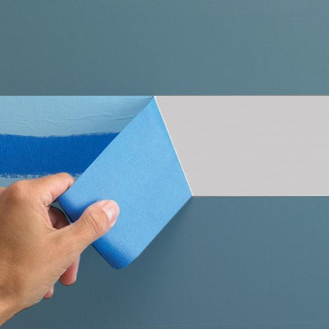
Add the Secondary ColorOnce the dominant color is dry, apply the secondary color to highlight significant areas like drawers, cabinet doors, or panels. Use painter's tape to create clean lines and avoid overlapping colors.
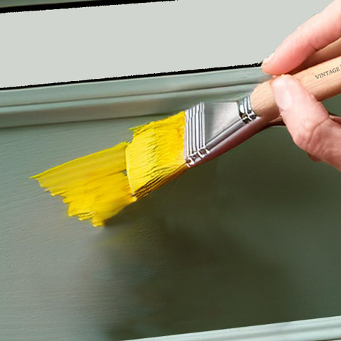
Incorporate the Accent ColorFinally, add your accent color to small details such as knobs, trim, or decorative elements. This step requires precision, so use a fine-tipped brush for best results.
4. Finishing Touches
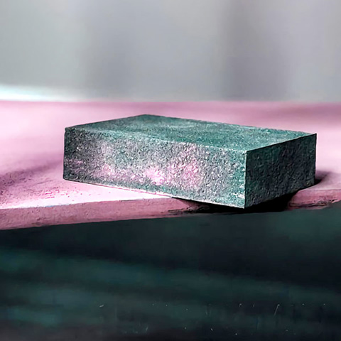
DistressingFor a vintage or shabby chic look, lightly sand the edges and corners of your furniture to reveal the underlying color layers.
Wax or SealantProtect your chalk-painted furniture by applying a clear wax or sealant. This will enhance the durability of the paint and give your piece a polished finish.
Tips for Success
Test Colors First Always test your chosen colors on a small area or a piece of scrap wood to ensure they work well together.

Balance & HarmonyEnsure the secondary and accent colors complement the dominant color without clashing.
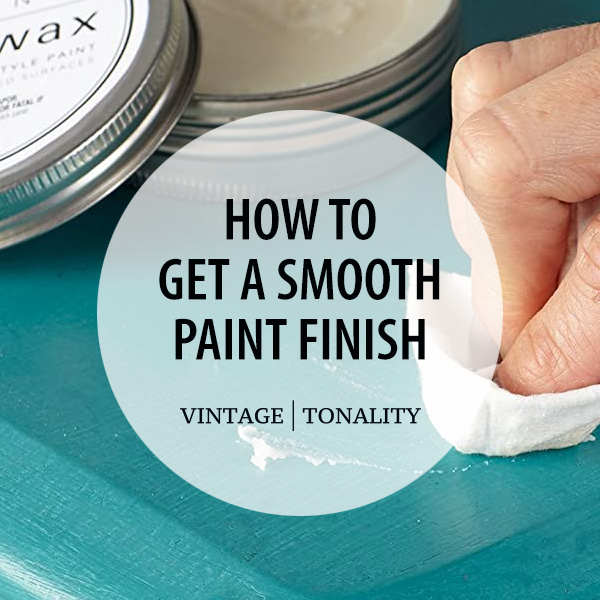
Layering TechniqueApply multiple thin layers of chalk paint rather than one thick layer to avoid brush marks and achieve a smooth chalk paint finish.
Conclusion
Using the 60-30-10 rule to chalk paint furniture may turn everyday pieces into remarkable works of art. By carefully selecting and mixing your colors, you may design visually attractive furniture that complements your home's decor. Whether you want a vintage, modern, or classic style, this rule provides a simple guide to producing excellent results. Happy painting!